
Ghent University uses the Bootstrap grid system; see below for more information:
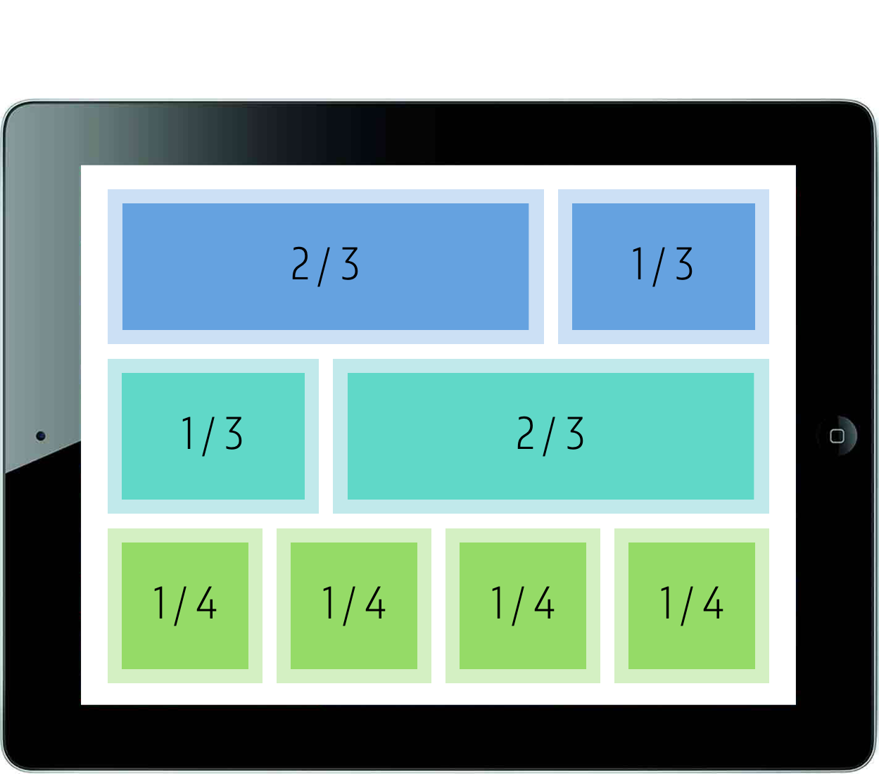
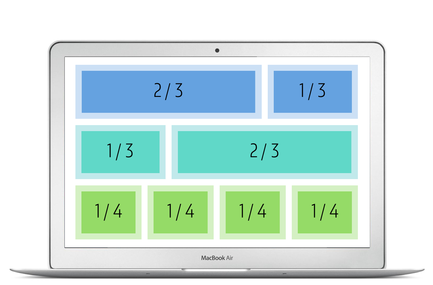
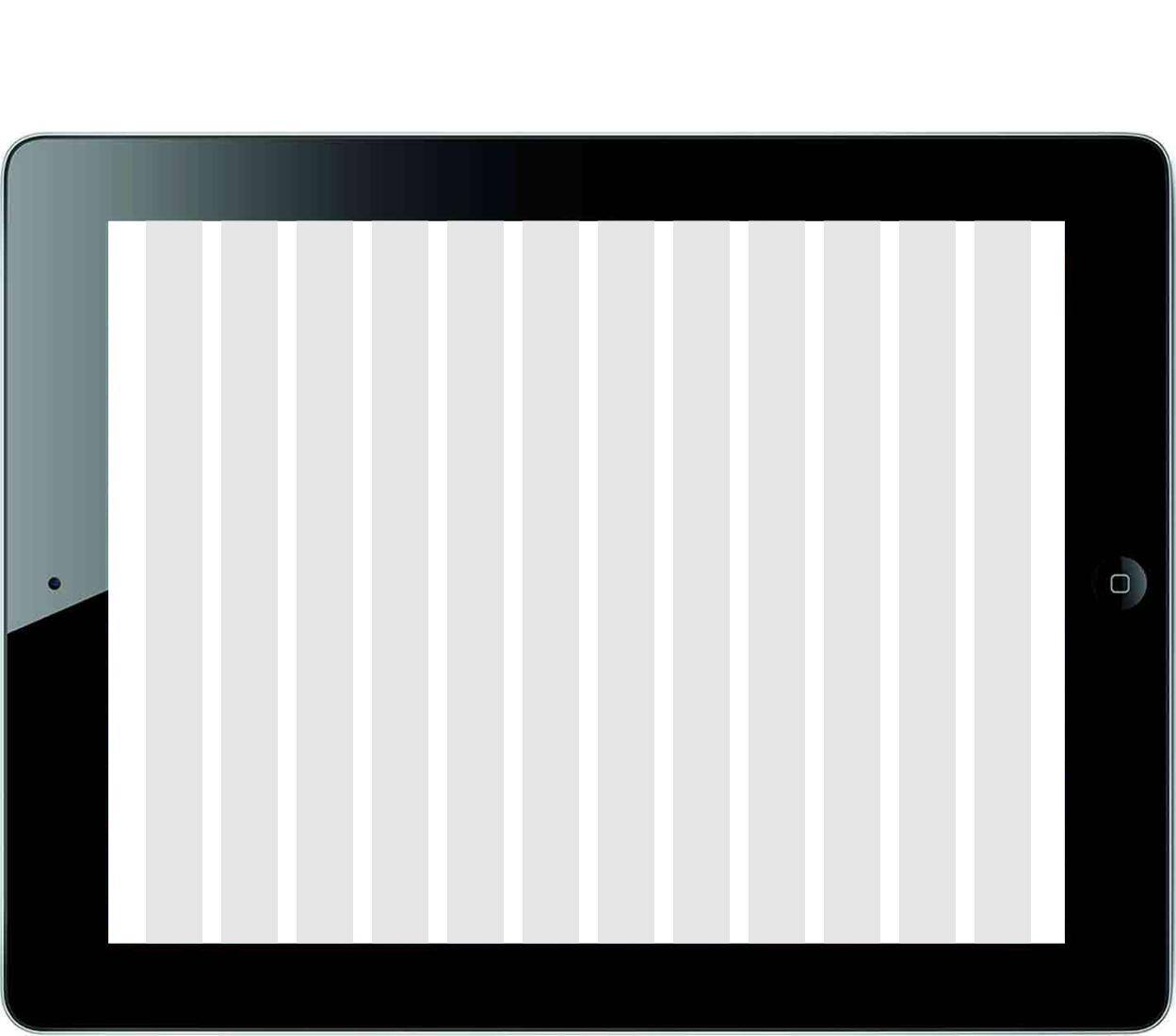
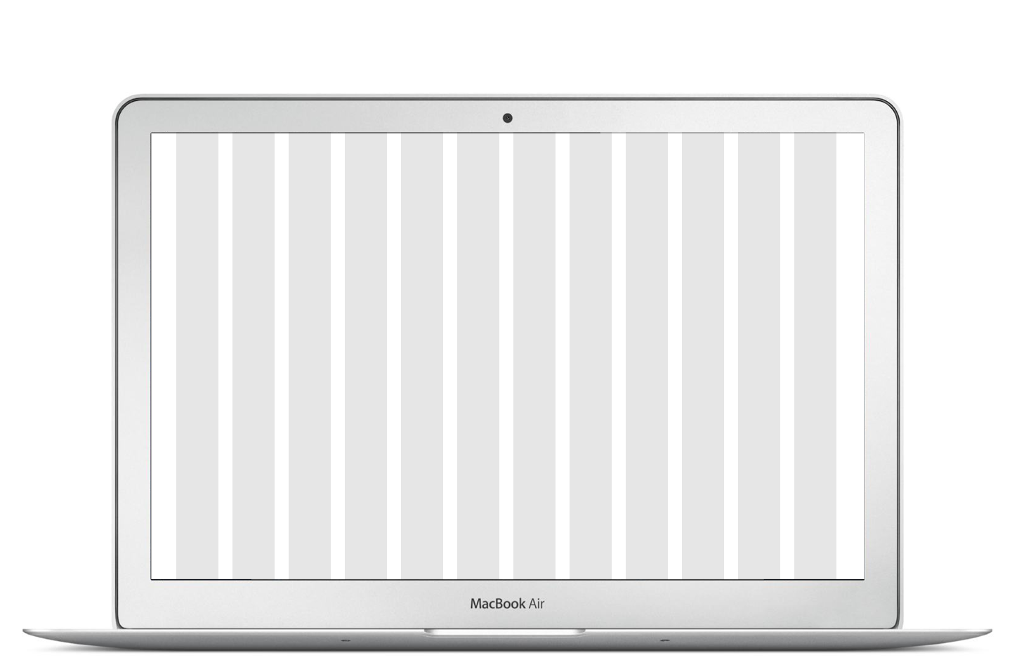
Below is an example of the column structure on mobile, tablet (portrait and landscape) and desktop.
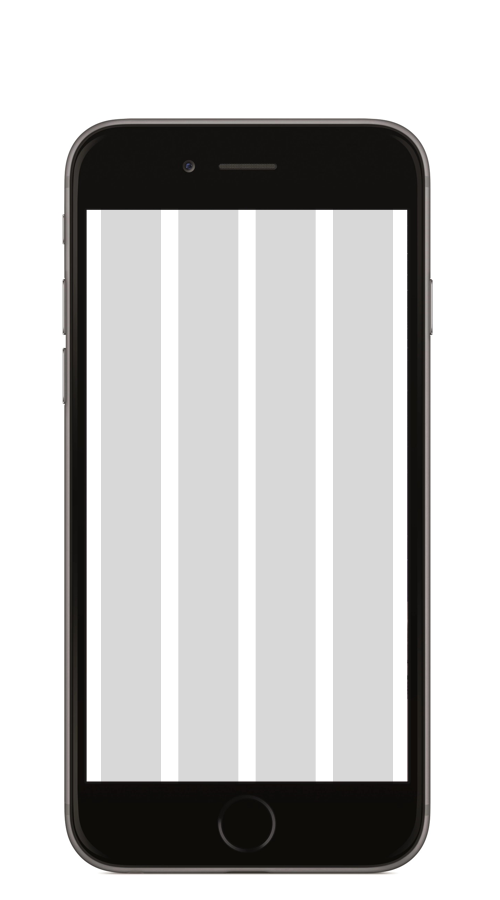
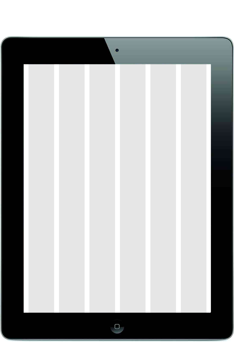
Below is the responsive behaviour of the content blocks on mobile, tablet (portrait and landscape) and desktop.
See example 7.1 Basic layout
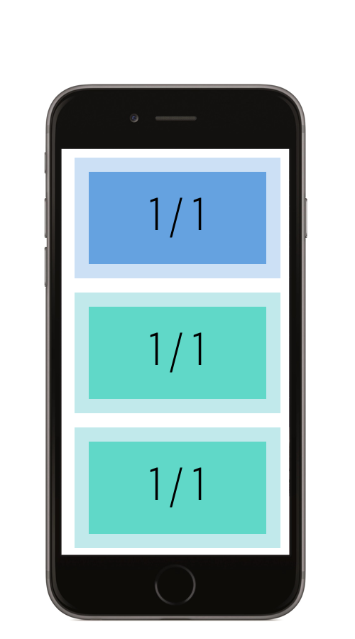
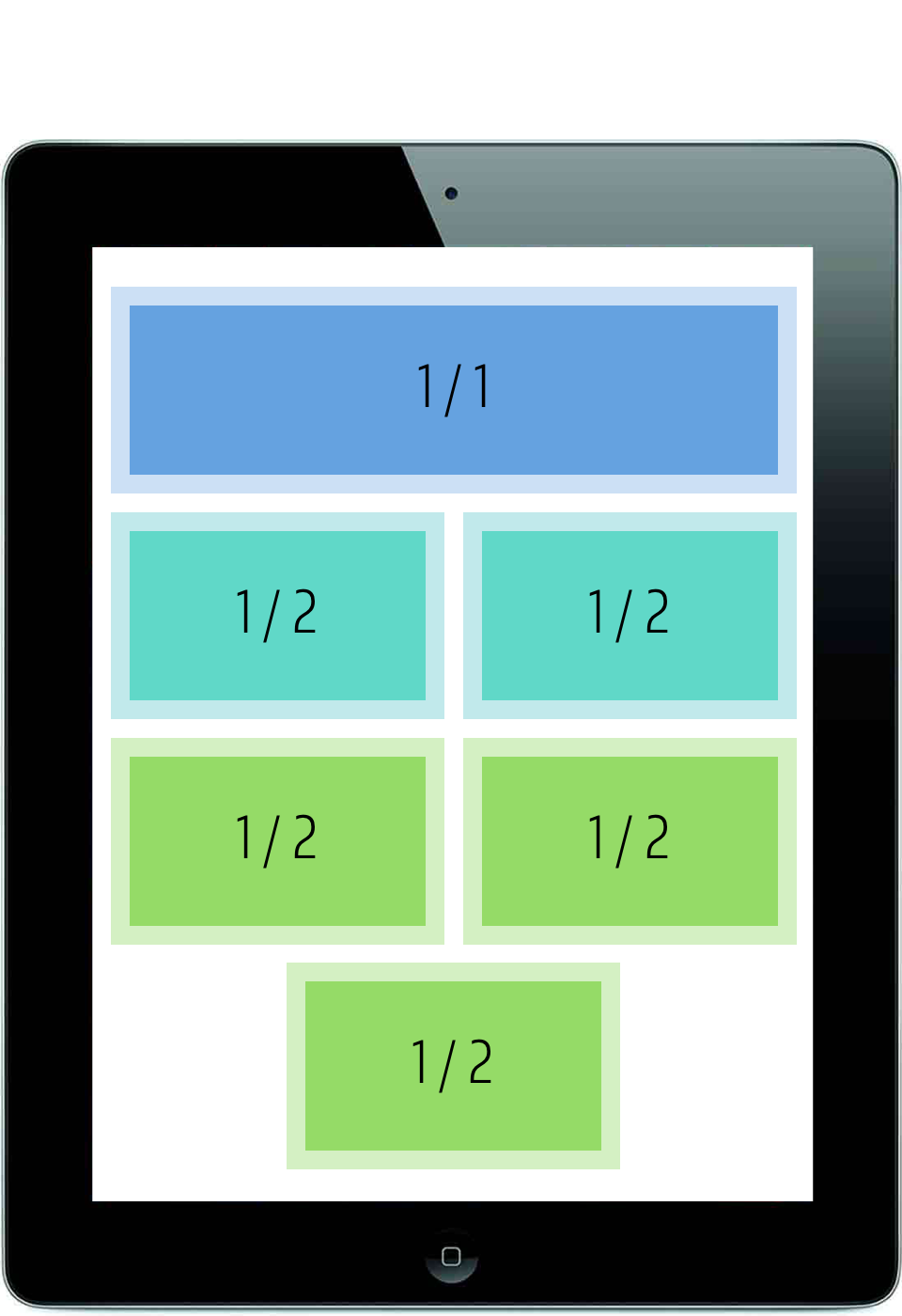
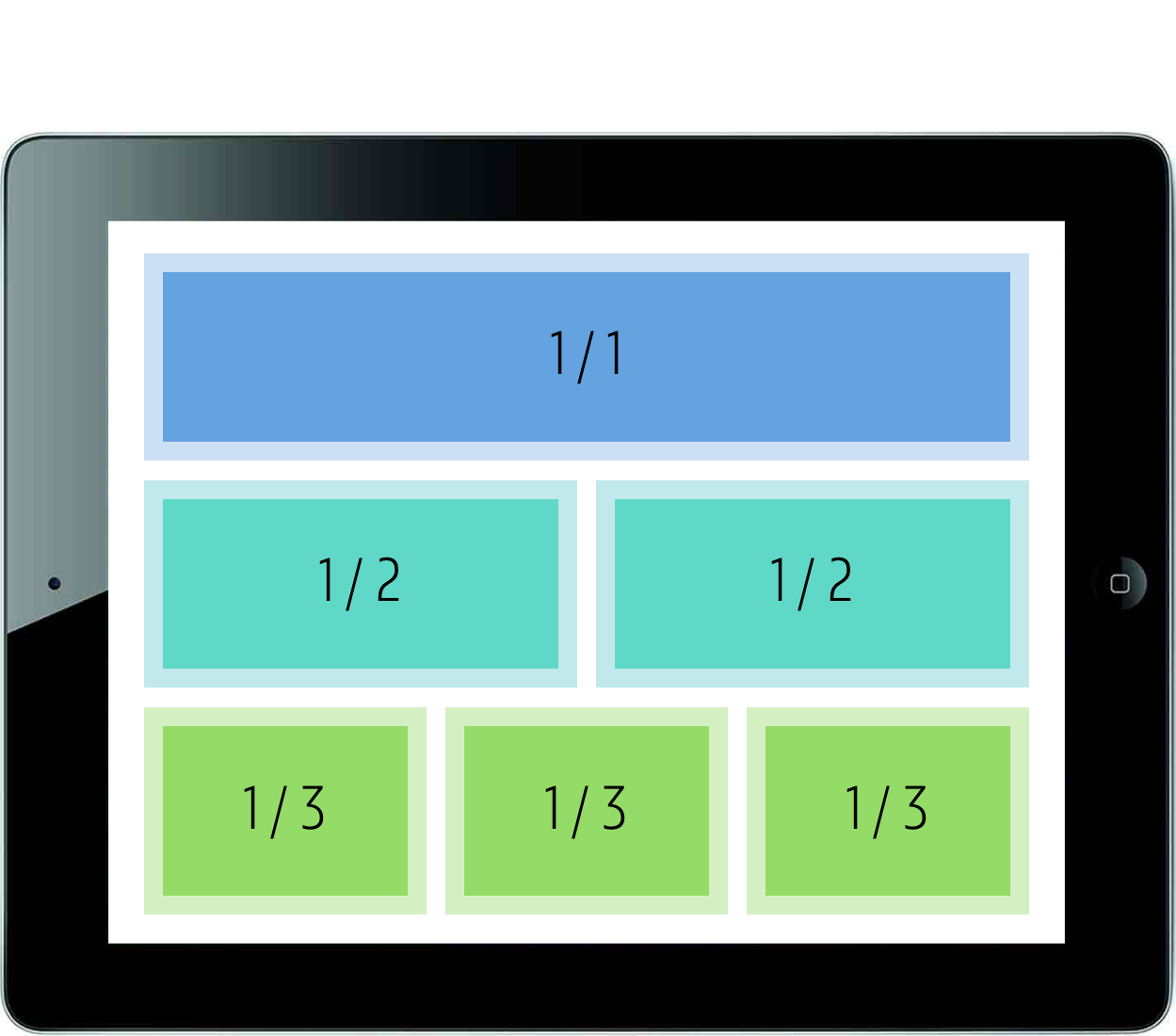
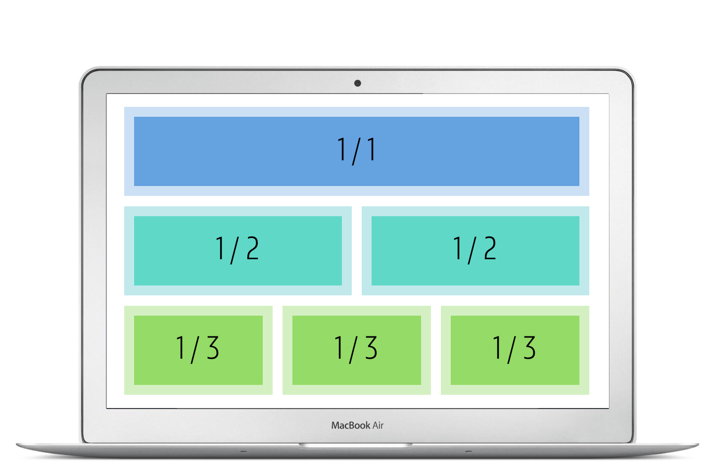
For the 12 column grid the content blocks are also outlined in the ratio 1/3 – 2/3 (light blue areas) or at ¼ of the width of the page (green blocks).
See examples 7.2 Selection page, 7.3 Detail page, 7.4 Detail page with page navigation
